by Michael Buck
2/12/2019
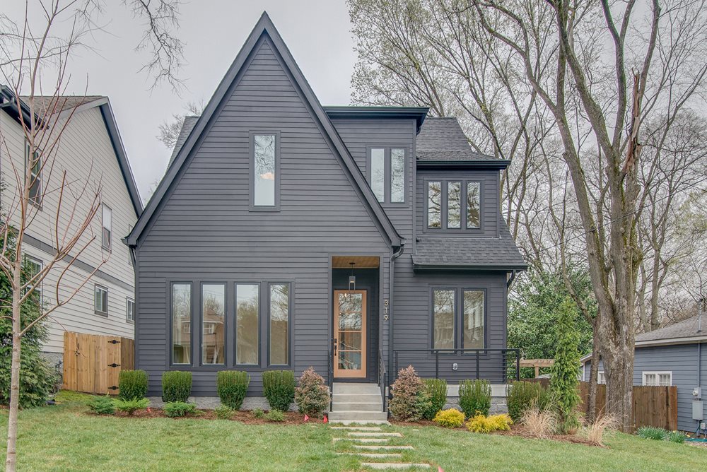
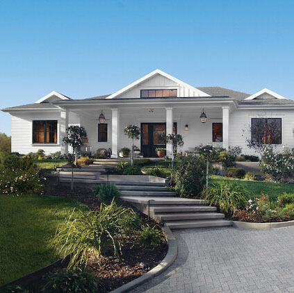
Homes that stand out can be a good thing, but only if they are done in the right way. Well-designed houses can be beautiful without design tricks. In many cases, simplicity is key. Plus, a streamlined design can lead to savings, which you can reinvest in other parts of the house.
Like all “rules,” there are exceptions. These general principles can be applied to most building styles in many parts of the country. Understanding them will help you articulate why some home designs feel better to you than others.
Explore more exterior house color combination ideas
Here’s what you need to know to make smart and simple exterior house design choices.
1. Simple roof design - minimize steps on the building
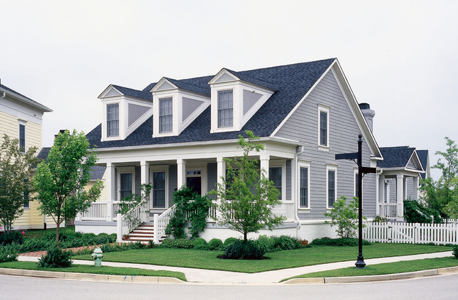
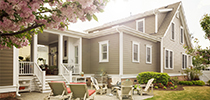
Simple roof designs are easier to build and look better than roofs with endless gables and steps. Consider the roof from the earliest stages of designing the floor plan. The longer framers are on the roof working, the likelihood grows that the house will cost more to build and maintain.
2. Use color and texture rather than additional elements
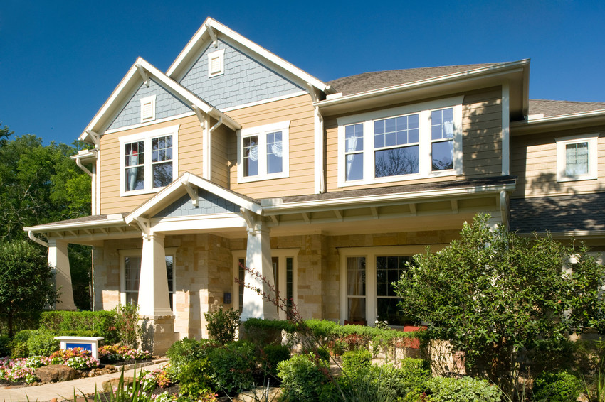
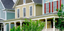
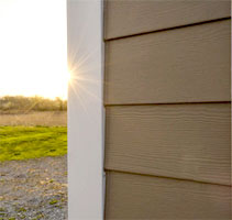
Using siding on the exterior of a home can add color and texture, enhancing the overall appeal of a house. Changing colors and materials adds value to the design if it’s done consistently and in horizontal bands, rather than in vertical strips.
For example, you could use HardiePlank® Lap Siding in Night Gray on your first floor, while changing to HardieShingle® Siding in Pearl Gray on the second floor.
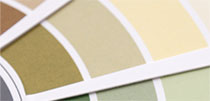
If you want more advice on color, check out these siding and trim color combinations.
3. Ask yourself: “Could this design feature work?”
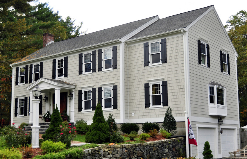
It doesn’t matter if it actually works. It just needs to look like it could work. Everyone has the innate ability to recognize both good and bad design, even when we don’t know why. The “why” often has to do with the most basic common sense: could the shutters close? Could the lintel really span that far? Does the placement of materials make sense? Does the front look completely different than the sides?
4. Minimize the view of front-loaded garages
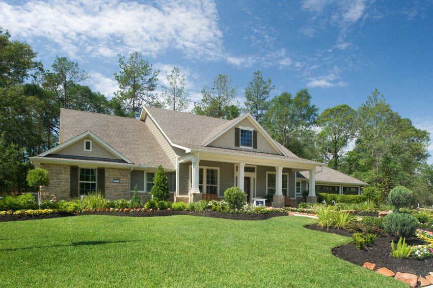
You can mitigate the effect of a front-loaded garage by pushing it behind the face of the building, ideally 18 feet or more. This allows a car to park in the driveway without showing in front of the house. Pushing the garage back does not require any more room. Compact, connected communities with narrow streets, alleys or side driveways require less land overall than communities where there garage is the central feature of the house.
5. Avoid double-height entrances
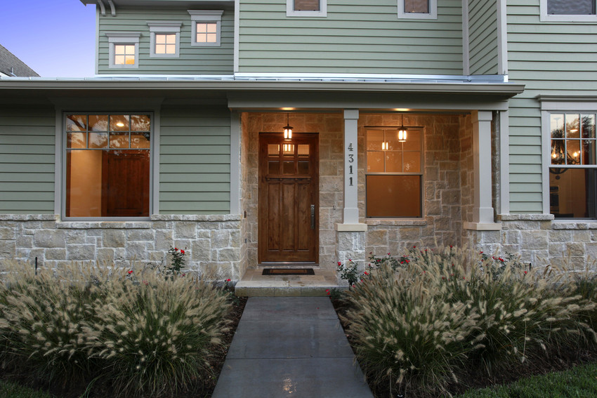
Your front door is key to a good first impression. Nearly every visitor to your home will engage with your front door. Double-height entrances are off-putting to many people. On some designs, the home’s entrance is often made double height in an attempt to add interest to dull elevation. The best entrances are ones that tell us where the door is and keep water off of us while we are waiting to enter.
6. Use vertically proportioned windows

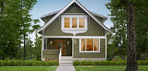
Window design will vary by house style and by region, but most windows have a ratio of either 1:2 or 3:5 (tall rectangles). In addition to the proportion of the opening, take care with the proportion of the windowpanes. Vertical openings and panes visually enhance the look and feel of the house. Also, don’t forget the windows on the side of the house.
A well-designed home does not need tricks. For your house to stand out in a good way, remember two things: keep it simple and less is more.

